Why your website design process is important
You often see the finished design, not the process. However, the designs that move you, inspire you, or compel you to take action have been through a complex and rigorous design process.
Website Design and Website Development have similar but distinctly different processes. This article looks at the website design process, please see this article for information about the Website Development Process. If you'd like to learn more about websites, click here.
Designers with years of experience in their craft work tirelessly on small details that make a successful design work - often those details are too subtle to see but you know it’s good design.
Two decades of design work have helped me hone this design process… Here’s the summary of what we learnt working on everything from branding, brochures, billboards, video and over the last decade websites, banners and digital content.
1. Discovery
We like to spend time getting to know you and your business. Design is very personal and it makes it easier to create a design aligned with your project when we know you. Part of learning about your business is finding out more about your Personas (see below).
2. Sketching
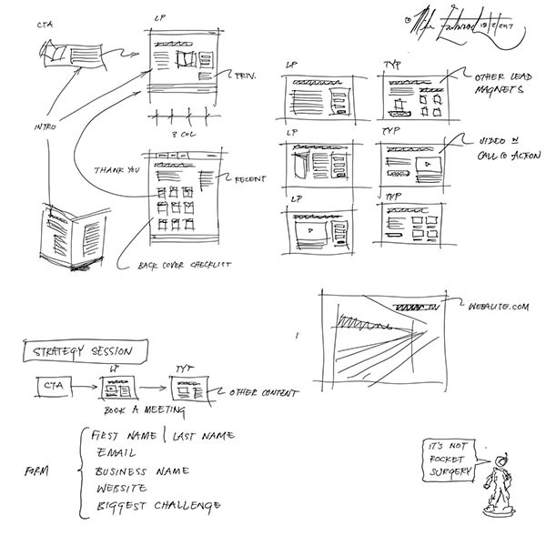
Sketching - how retro - sort of. The sketching is now done on an iPad Pro (we’re paperless). Sketching allows lots of ideas to be explored quickly. Sketches allow us to communicate ideas and concepts with the team and you.
3. Low-fi Mock-ups
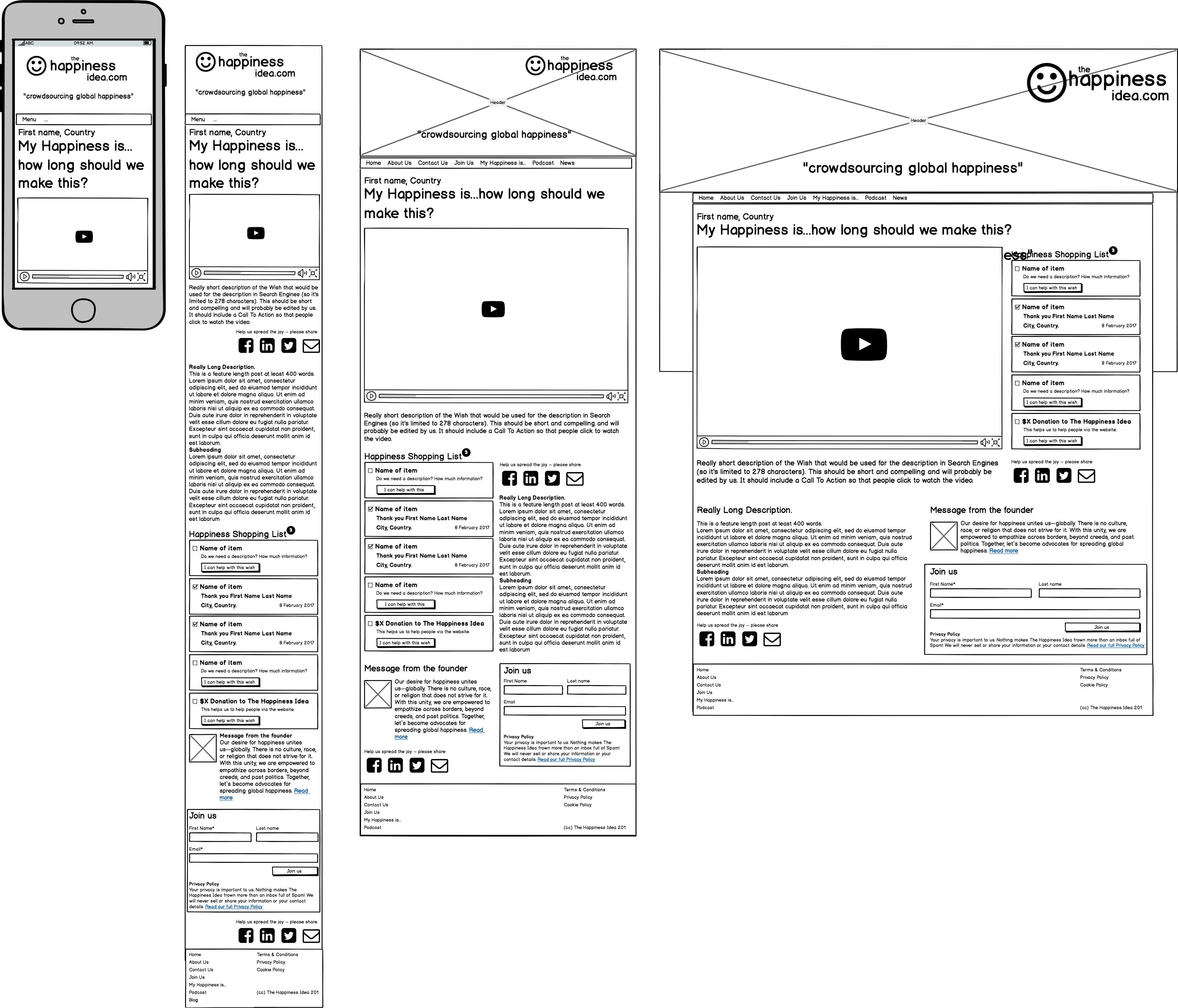
Once we’ve resolved a few concepts we’ll explore them more in a mock-up app. Our favourite is Balsamiq. This allows us to refine the functionality without being distracted by the aesthetics.
Mockups make it easy for us to try multiple concepts and see a progression as we resolve design and User Experience UX.
The mockups are stored in Confluence, our project wiki, so we can add comments, edit content, leave notes and keep refining the design before a line of code is written.
4. Hi-fi Design Mock-ups
Once we have the User Experience mapped out we can work on the high quality mockups. The advantage of this step is that the design can be optimised quickly before we create the style rules and templates.
We typically use Adobe Experience Design (XD) because it allows us to work on different screen sizes and preview on different devices. By using Adobe XD we can use all the hi-fi design mock-up settings right in the CSS (cascading style sheets) that are used in your website theme.
5. Design concept presentation
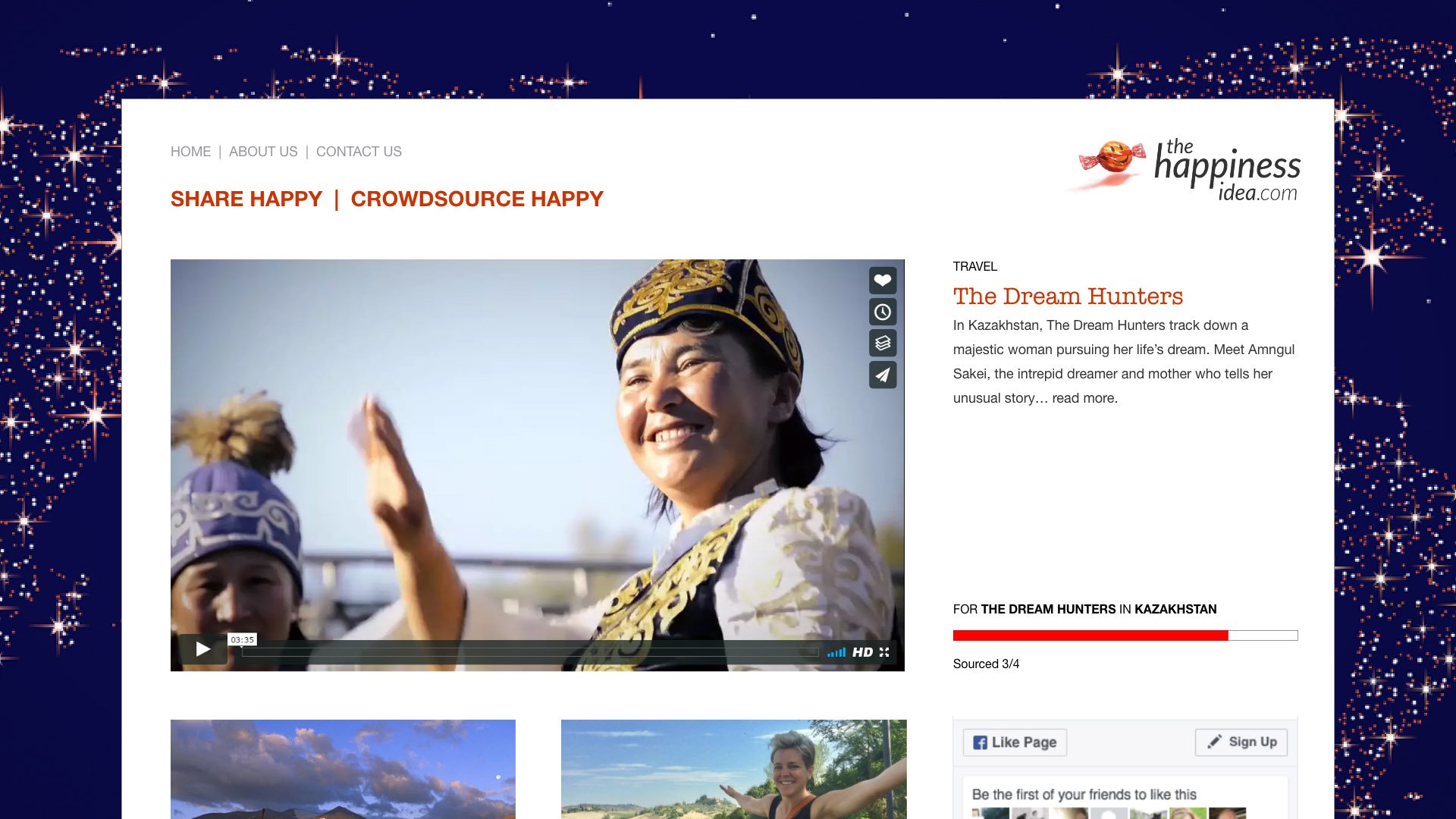
We recommend a full concept presentation – with three design options. When we create multiple options we can explore different ideas – some of the designs will be close to your current look and others more future focussed.
Once we’ve discussed the design concepts we’ll integrate the feedback and refine the final concept which we present for sign off.
A single concept presentation is only possible if you have a thoroughly documented brief and brand. If you’re missing any of the required items (see below) the project will take longer and need more work than just creating a design.
6. Design development
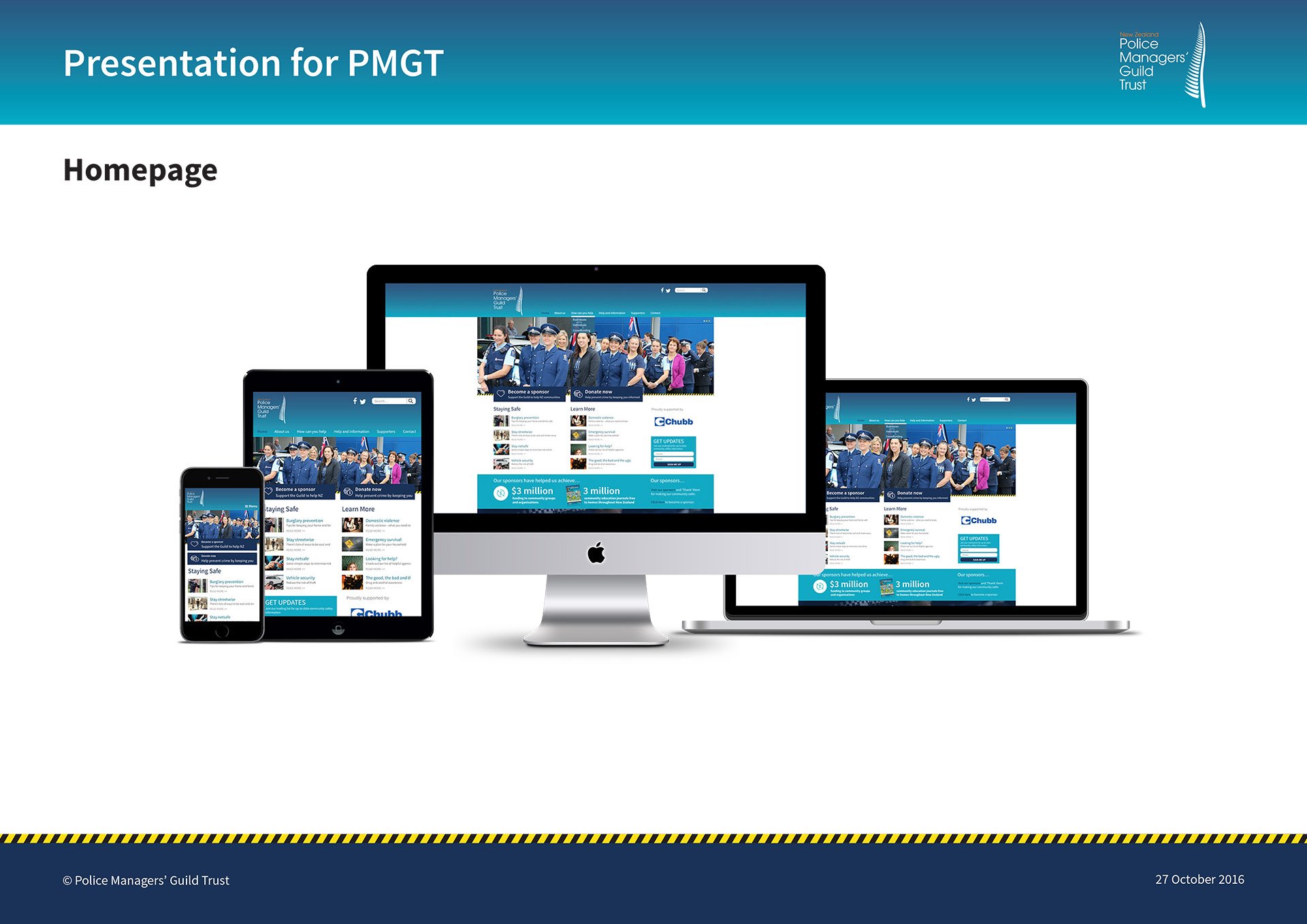
We then create the templates and CSS(Cascading Style Sheets) using Adobe Dreamweaver because it’s great for refining designs and CSS rules (not ideal for coding). We create HTML mockups of the final templates before we write the code for the templates. This means we are design driven – as opposed to trying to style the code after it’s built (the design is the priority, not the developer).
Once we’ve resolved the templates we create the code to render the design we’ve refined. This process varies depending on the how the design is being served.
WordPress Theme Design
We create a custom WordPress theme from scratch so we have lightweight (fast) easy to maintain designs. Everything lives in Version Control so we can see the history of the code (which makes it safe and easy to develop).
HubSpot COS Theme Design
HubSpot uses a templating system that we can extend to create our own custom design. We work with a local HubSpot Server so we can test the designs before we upload them to your HubSpot Portal.
7. Design implementation
Now it’s your turn! If you want to? Otherwise we’re happy to implement and optimise your content for you.
Typically, when we are adding the content, we find a few style rules that need polishing.
8. Design testing
We need your help. No matter how much we test we always need fresh eyes to double check the designs. Don’t worry, we’ll give you a cheat sheet to help you test and log an issue in our support system.
We test as we design on Mac and Windows, Google’s Android and Apple’s iOS (mobile devices). And we test different screen sizes including desktop, laptop, tablet and phone.
9. Other design applications
Which Social Media channels do you use? We can apply the design across your different pages so your design is consistent online.
10. Refinement and improvement
Good design evolves. By continually testing and measuring your result you can refine the design over time.
Unfortunately – and fortunately – your website will never actually be "finished".
What we need from you during the design process?
There are lots of things you can do to help ensure a successful design process. If you can deliver these items on time, or in advance it makes the process easier for everyone.
1. Design Brief
The more you share with us the easier it is for us to align your design to your goals. If you don’t have a brief, or have never written one before, ask mike to help you prepare the document.
Be specific, include examples of things you do and don’t like.
2. Competitive analysis
Who are your competitors - direct and indirect - and who are they targeting? Do you compete on quality, service or price?
Studying your competition helps us position your design in your market, so your target audience knows what sets you apart.
3. Style manual
We’re always excited when we get a brand guidelines or a style manual before a project. Your branding company put a lot of effort into creating your brand and we’d like to ensure we leverage their work.
No style manual? Would you like us to create one for you? A style manual has all the options, and rules, for using your logo and brand - typography, colour, images, etc. you can give your style manual to anyone working on design collateral whether it’s in-house our an external provider.
Having strong guidelines makes it easier for your to keep your brand consistent.
4. Personas
Personas, or Avatars, are fictitious characters that represent your ideal customers.
Your personas help us create a design that communicates directly to your persona.
Too often the design process becomes focussed on the marketing teams personal opinion when we’re really creating the design for your target market, not you.
5. Marketing Plan
A single page - or a short novel - it doesn’t matter how long or short it’s great to see your plan so we can ensure your design aligns to your plan.
No marketing plan? Maybe we should spend some time working out the direction before we redesign your website.
6. Content
Your website is the home for your content. We need high quality content - lots of it. If you don’t have content our team is happy to create it for you.
Do you have high quality original images for your business, your product and your team? Images convey emotion, values, energy and more. Cheap stock images just won’t cut it.
The design process seems like a lot of work
Yes, it is. It's an investment – for all of us – and when it's done correctly it's an investment in an asset that will far exceed the value of the budget, sweat and tears.
Next Steps
Book a time with Mike to discuss your website design project.
